

Microsoft Admin Center: Quoting, Cart, & Checkout
Note: Due to NDA, some designs have been omitted.
Case study focus: Product iteration, User flows, Visual design, Team communication
Timeline: 2 Months
My Roles: Solo UX Designer
Team: Quoting, Cart, and Checkout PM, Azure Team PMs, Quoting Center PMs, Devs Leads
Problem:
The Microsoft Admin Center (MAC) is a portal where admins perform many different actions including purchasing software, subscriptions, managing licenses, and paying their invoices. There were two key problems to be solved during this project. The first was to design a consistent experience for the quoting, cart, and checkout experiences for the Microsoft Admin Center (MAC). These pages needed to be slightly different to give users better allow users to understand what page they were on and to give contextual information for the step they are on.
The second problem that needed to be solved was to create a specific flow in the Quoting, Cart, & Checkout (QCC) experience for customers who were transitioning from an older agreement to a modern agreement type. This flow existed in the middle of a larger flow involving the Quoting Center portal and the Azure Management portal. This project involved a large team with many different sources of feedback and approval from high-level positions at Microsoft.
Problem complexity:
The MAC is for commercial customers and the purchases they make often involve different product types, pricing models, and discounts. These pages needed to display an adequate amount of information, enough to understand the amount that they will be charged per individual items, without having too much information to avoid overloading the user.
Time was also a very big challenge. My first deadline was 3 weeks to be ready for a C-level review of the work. I needed to understand the existing experience and why things were that way, as well as the user, business, and legal needs, and create the designs within that time period. Due to the large amount of people on this transition flow, communication skills were key to make sure all requirements were met.
Deliverables:
The deliverables at the end of this project for this project were several different flows and scenarios for the different experiences. These flows covered the transition experience, multiple edge cases, and different countries needs.
Process

Kickoff meeting
I started this project by working the quoting PM to understand the business needs and asked questions about the current existing designs. I had to scavenge through the old designs that had been created by a different designer and study them to understand the design directions that had already been explored. I then inquired with my design manager about which design direction had received the most positive feedback from previous feedback sessions.
Design direction and flows
Armed with this information, I delved into the flow charts of the different scenarios that could occur and used them to create flows for the QCC experience going down a “golden path,” one where the user was able to go through the transition experience without any problems. I then introduced alternate scenarios where users encountered different problems, constraints, and needs. I created high fidelity mockups of these different flows, and used the flows to inform my designs of the QCC pages to meet their needs.
InternAl High fidelity designs
After creating the initial high fidelity screens and checking to make sure they met all the needs, I explored multiple ways to visualize these pages. With my designs I did rapid internal testing to get feedback upon my different designs and iterated upon the designs quickly.
Transition team meetings and feedback
We then had multiple feedback sessions over two weeks with the Modern customer agreement transition team, which was made up of the Admin Center (My PM and I), the Quoting Center team (a Microsoft retailer facing portal), the Azure team, and dev leads. These meetings focused on insuring that the team’s designs provided a consistent experience for the transition flow from start to finish. One of the key pain points I had to solve was figuring out the best way to let users know they were not done with the transition flow after they reached the confirmation page for their order. Additionally, this involved me working with the PM in charge of emails for the MAC to design an email specifically for this transitional flow.
Post C-level review
After the C-level exec review, I spent a month polishing the visual designs to keep them up to date with the rest of the MAC, as the MAC’s visual design system was still evolving and changing often. I also continuously made tweaks to the design based on feedback rolling in from the legal and business teams. Over this period I also started fleshing out and designing additional features of the QCC pages, such as being able to modify items in a quote and being able to change the user’s PO # permanently in the flow.
Ecosystem flow
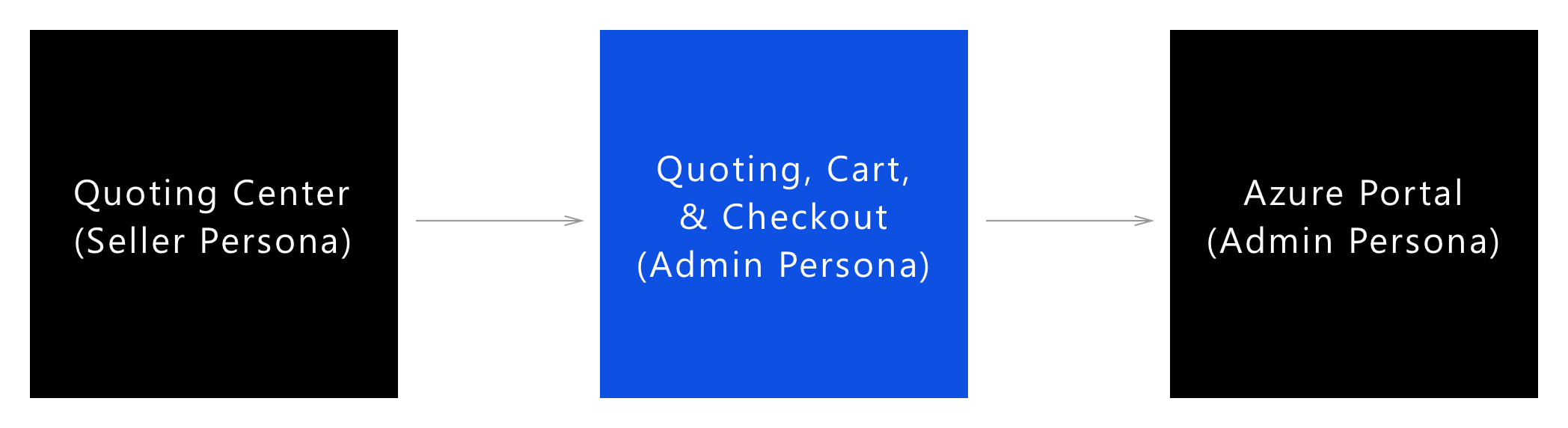
The transition experience moves through several different portals including the QCC experience.
The QCC pages need to work in several different larger flows. The quoting experience starts with a Microsoft retailer sending the user a link through an email or through the quotes page in the admin center.
The cart experience may be entered from the quote page, or from a the users “purchase service” page. Once users have finished the checkout experience, there are several flows that need to be supported. Users need to be able to do primary actions, such as migrating their account in the Azure profile, and do secondary actions like assigning licenses from purchased products.
Designing pages to meet user needs:
Quote/Cart
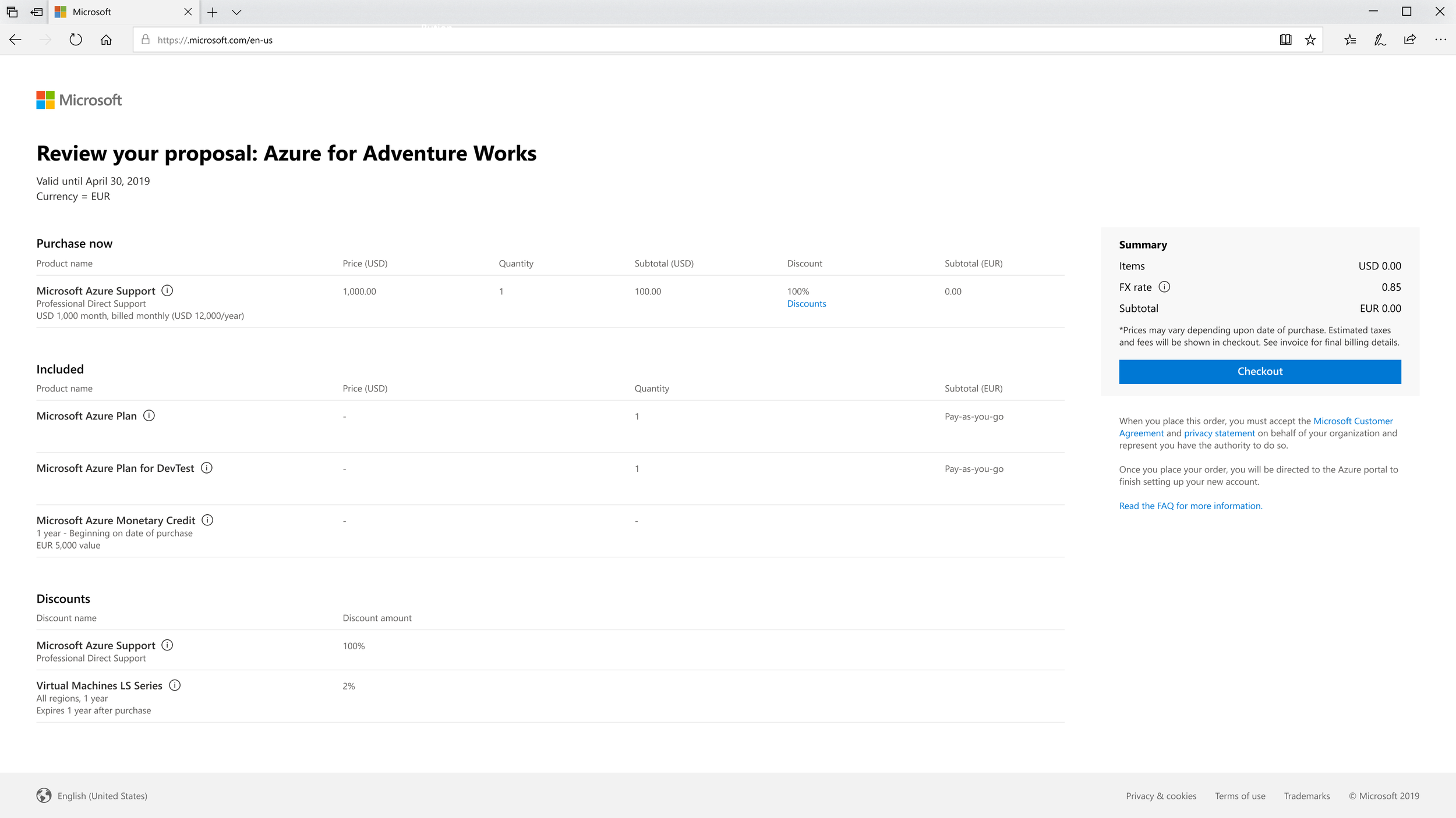
The different pages needed to display different information that was consistent with the users needs. For the cart page, I needed to understand the vast array of products to design a layout that would work for each product type. These products often had different billing methods as well as several types of discounts.
Checkout
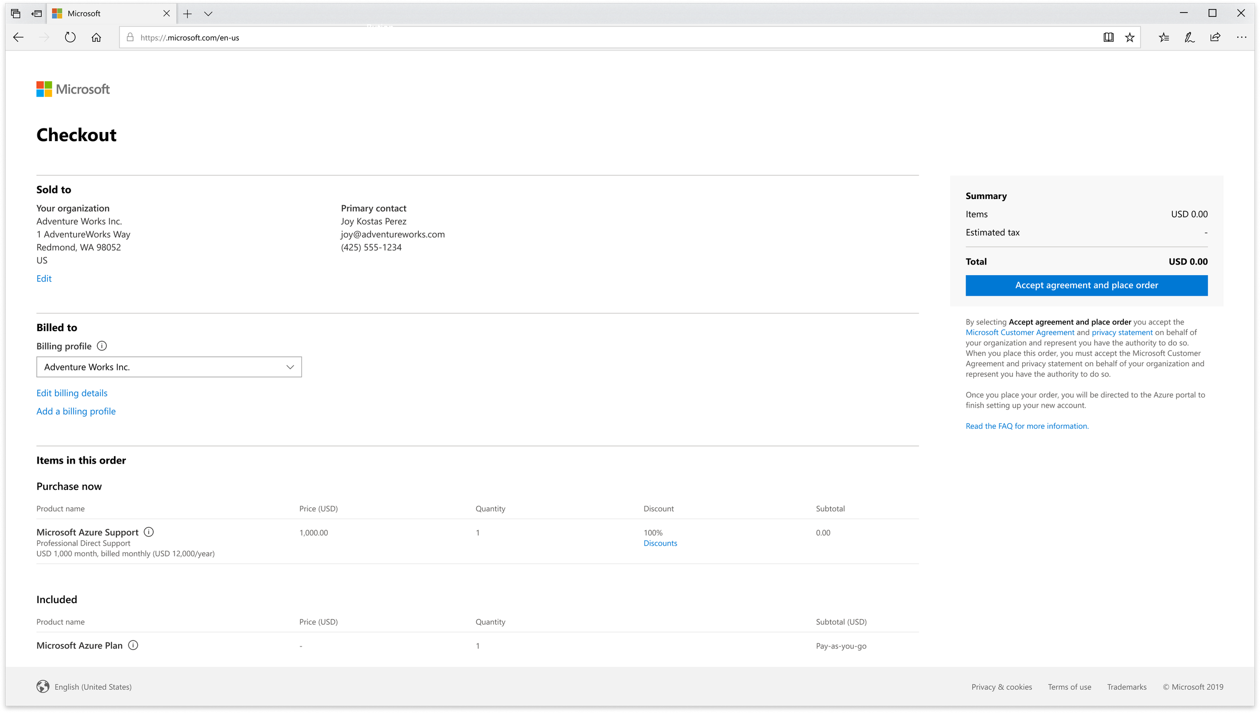
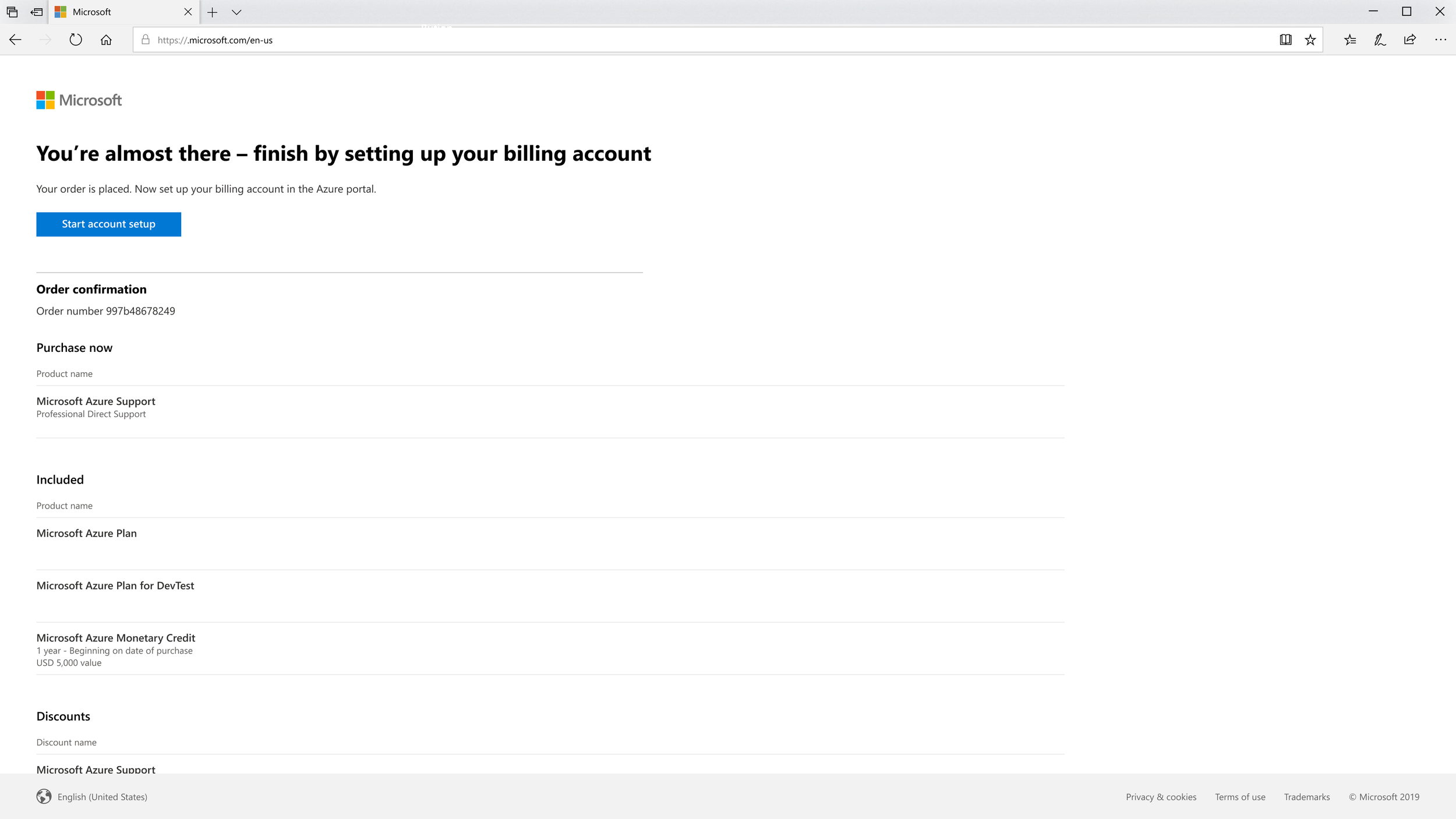
Confirmation Page
The checkout page page needed to show the purchaser’s information, their billing information, and the list of items being purchased from the cart page. The page also includes a way to edit their purchase and account information. I placed priority on the purchasers information - even though it’s unlikely users would edit this data, they are still assured that this purchase is going to the right account. Additionally, users can also create new billing profiles (a way to pay), assign PO numbers to their order, or change the PO number for their account.
Designing multiple flows:
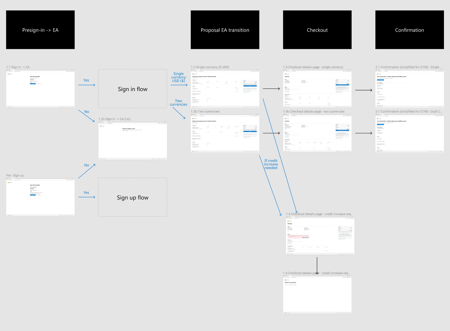
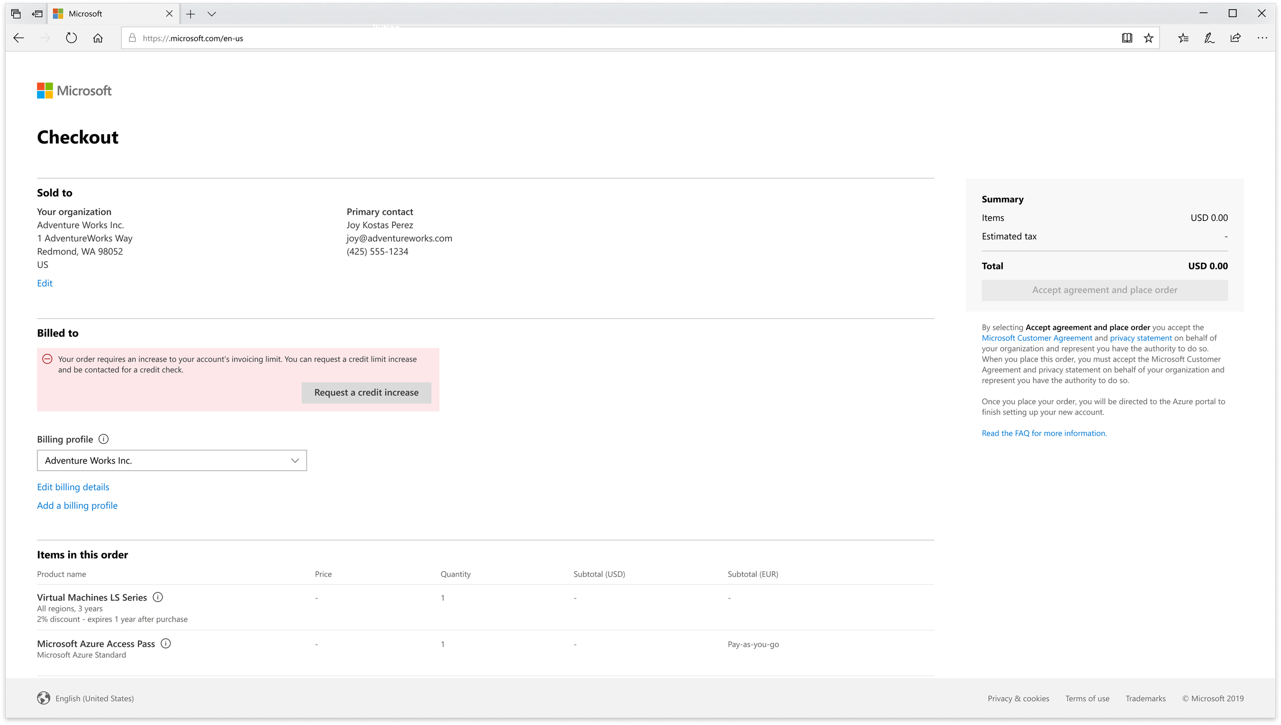
This is part of the transitional flow for the conversion to a Modern agreement. The flow includes different paths for users depending on their scenarios.
For the QCC experiences, I had to create many different flows for a variety of situations to match the user needs. This meant that each page and some different building blocks of the page needed to change depending on the users scenario to make sense. Some of these common cases were things like credit check increases, multiple currency types, and whether the user had a billing profile already or not.
Final Designs:
Retrospective:
In the span of 3 weeks, I picked up an entirely new work area in a very short turnaround time and create multiple complex flows for commercial customers with multiple needs. The project went very well and I learned how to interact with very large teams effectively and learned how to manage feedback coming from multiple sources. After the 3 weeks, incremental feedback kept rolling in from different teams and I needed to be able to remember my knowledge of this project while balancing other projects.
I learned also that I cannot always rely on shorthand notes when a project team is this large and feedback is slowly rolling in over several months. If I were to do this project over again I would have made better notes noting where different feedback pieces came from and more details about the different design decisions and I would not have to scavenge to find my reasoning that were made so that the project can keep moving forward.