Azure Build Health: Comparison View
Crafting a comparison view for a developer platform to show clear data trends and changes between builds to optimize workflows

At a Glance
My Role: Solo Lead UX Designer, Full E2E Design: Scoping, Research, Interaction & Visual Design, Prototyping
Timeline: 3 Months
Team: 2 Product Managers, 1 Senior Developer, 1 Principal Developer
Problem
Azure Build Health (ABH) is an internal dev platform at Microsoft that reduces the risk of bad code being deployed which can bring down Azure services. Release Managers, Senior-Staff level developers and TPMs, at Microsoft assess code changes for risk and quality before deployment. A key part of this workflow is identifying and tracking regressions to ensure releases pass Microsoft's stringent quality gates. ABH's test tab only shows data from a singular build at a time, making it hard to compare builds and catch regressions. Without comparison tools, teams rely on time-consuming manual workarounds, slowing down releases and risking missed regressions.
I needed to Enable Release Managers to quickly and confidently compare test results across builds, while accommodating diverse team workflows, pass criteria, and test group structures.
What I Did
I owned and led the end-to-end design of the comparison features (as well as the entire test tab), conducting research, defined the visuals, created user flows, prototypes, and aligned efforts between multiple product and dev teams to make key architecture changes.
Impacts
20-30
minutes
Saved comparing builds per release for users.
20-30
minutes
Saved comparing builds per release for users.
20-30
minutes
Saved comparing builds per release for users.
8%
Accuracy
Increase in users finding regressions in their build comparisons.
8%
Accuracy
Increase in users finding regressions in their build comparisons.
8%
Accuracy
Increase in users finding regressions in their build comparisons.
Product Alignment
Aligned team on product direction, scope, and dev architecture changes to accommodate further comparison scenarios.
Product Alignment
Aligned team on product direction, scope, and dev architecture changes to accommodate further comparison scenarios.
Product Alignment
Aligned team on product direction, scope, and dev architecture changes to accommodate further comparison scenarios.
Pixel Preview
Azure Build Health's Test Tab comparison feature allows users to compare data between two separate builds quickly to spot regressions.
Build Comparison, Scoped as a Standalone Experience
I joined the Azure Build Health Team as the product’s second designer. When I picked up this project it was scoped as a data visualization experience to show regressions in builds in a separate experience from the test tab. While onboarding I needed to learn about the current implementation of the test tab while also visualizing & designing the new regression tab.
Regression Tab
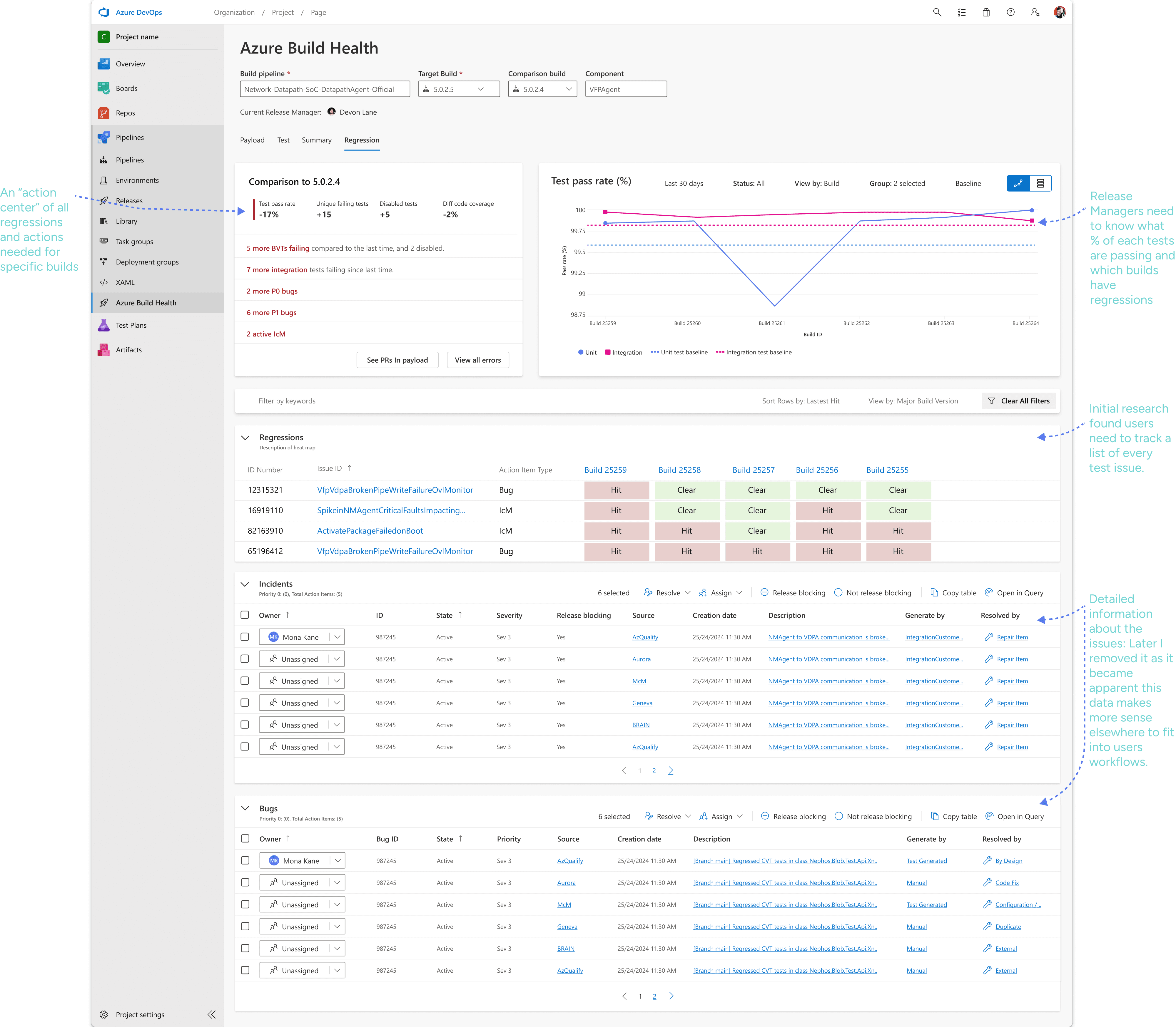
Combining Singular and Comparison Builds into a Singular Page
After talking to customers, I identified that creating a separate regression experience would create a gap in the experience, separating the comparison experience from the already existing test tab. With this insight, this project merged into a large cross-team collaboration project to re-do navigation across Azure Build Health, another project I worked on.
Understanding what Release Managers find Valuable in Comparison Views
As part of the work on the unified navigation project for all of Azure Build Health (ABH), I had created designs that combined the regression tab multi-build scenario with the single build experience in the test.
Test Tab: Single Build active

Test Tab: Multiple builds with build selector active
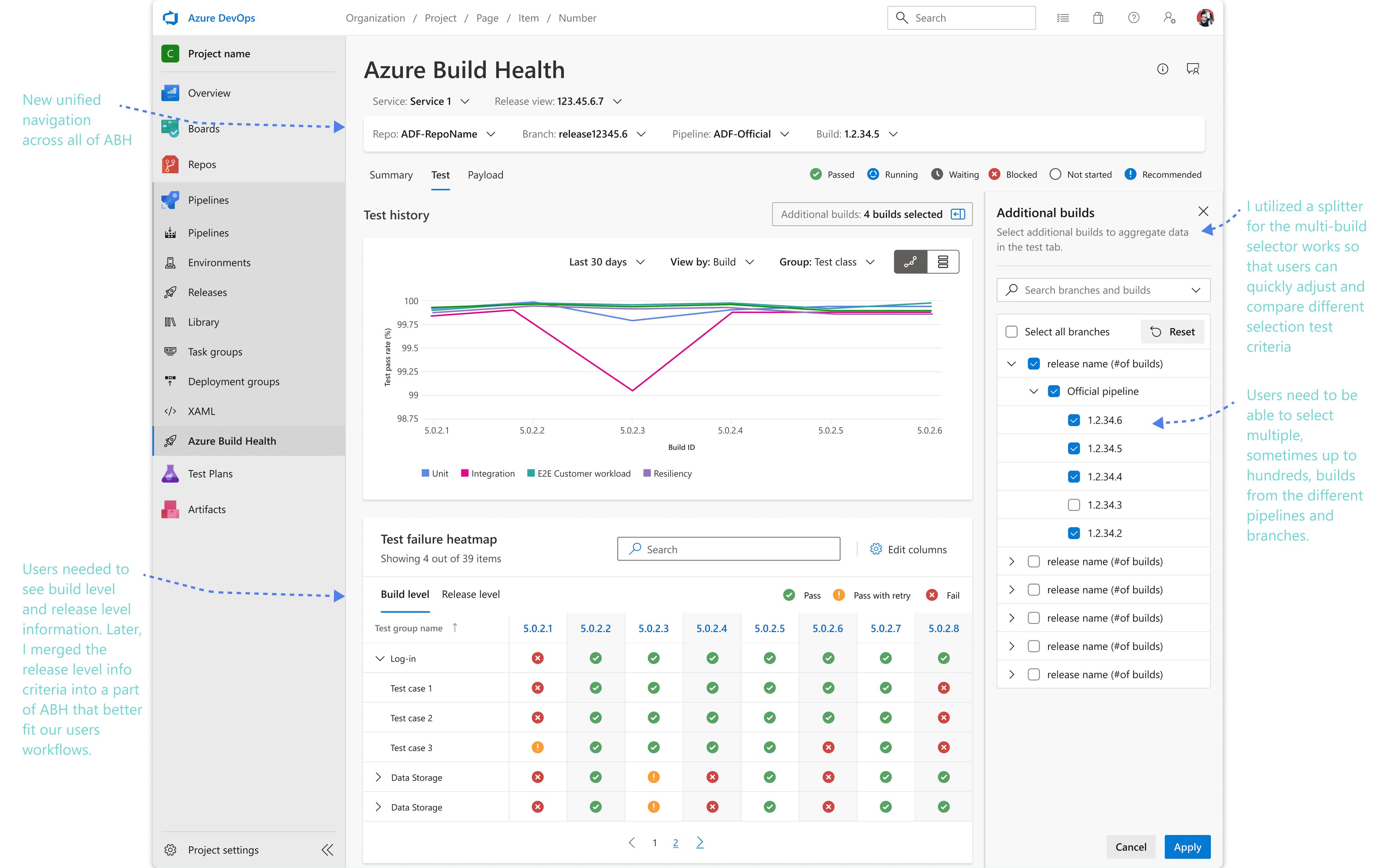
Discovering Additional Complexity
I needed to validate these designs with ABH’s main users, Release Managers (RMs). To understand RM’s needs, I interviewed six different teams across Microsoft.
Open Questions
1) What data points Release Manager’s find useful when comparing multiple builds
2) Learn what scenarios RM’s support
3) Understand RM’s processes comparing builds
Method
During research sessions, I had Release Managers meetings walk through a few prototype screens. I used these screens to guide the conversation and discover hidden nuance and complexity, learn about their different use cases, and spark deeper technical discussions.
What was learned
3 different comparison scenarios emerged from the research along with what insights about build quality was most useful to them to make the best-informed decisions.
3 Separate Scenarios to Solve
1:1 Comparison
The most common scenario, comparing two builds to see where new test failures were introduced.
1:1 Comparison
The most common scenario, comparing two builds to see where new test failures were introduced.
1:1 Comparison
The most common scenario, comparing two builds to see where new test failures were introduced.
1 vs Many
Compare 3 or more, potentially hundreds, of builds against each other (1 vs many).
1 vs Many
Compare 3 or more, potentially hundreds, of builds against each other (1 vs many).
1 vs Many
Compare 3 or more, potentially hundreds, of builds against each other (1 vs many).
Aggregate
Two teams aggregate the test results of several builds into a singular "meta-build" that they use as a build.
Aggregate
Two teams aggregate the test results of several builds into a singular "meta-build" that they use as a build.
Bill Payments
Two teams aggregate the test results of several builds into a singular "meta-build" that they use as a build.
Scoping and and Prioritizing 1:1 comparisons
While I originally tried to solve the three scenarios with a one size fits all solution, we found that the 3 different use cases required showing different types of data and trying to combine them created a disjointed experience.

1 vs 1 build comparison

1 vs many comparison
Based on user demand and implementation time, the MVP was focused on only the 1:1 build comparison use case. The PM and I consulted our developers about the size of each feature and ask to establish a priority list of features using the MosCoW method.
Finalizing the 1:1 Comparison View
With a several 1:1 design concepts and data paradigms, I conducted another round of concept validation with customers. During these interviews I focused on understanding how teams group, filter, and examine test data to create a design that supports all of their use cases.

Impacts And Learnings
20-30
minutes
Saved comparing builds per release for users.
20-30
minutes
Saved comparing builds per release for users.
20-30
minutes
Saved comparing builds per release for users.
8%
Accuracy
Increase in users finding regressions in their build comparisons.
8%
Accuracy
Increase in users finding regressions in their build comparisons.
8%
Accuracy
Increase in users finding regressions in their build comparisons.
Product Alignment
Aligned team on product direction, scope, and dev architecture changes to accommodate further comparison scenarios.
Product Alignment
Aligned team on product direction, scope, and dev architecture changes to accommodate further comparison scenarios.
Product Alignment
Aligned team on product direction, scope, and dev architecture changes to accommodate further comparison scenarios.
Learnings
Between concept validation and synthesizing the feedback to iterate on the designs, there was a 2 month gap due to a company wide initiative to focus on security. Once the fire drill was over and we were able to return to this project, it took much longer than if I had synthesized the data before pivoting to the security work streams. Being able to pivot is important, but so is prioritizing when you pivot, and the ability to maintain or return to a product with momentum, especially if the work stream will be returned to in the near future. Since then I learned to maintain more structured documentation for projects that are dropped or paused to ease that burden.